S&P 500 Index Chart
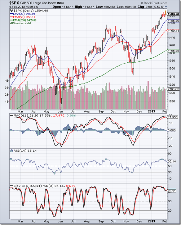
Last week’s analysis of the 1 year daily bar chart pattern of S&P 500 concluded with the following comment: “The odds of a correction/consolidation is increasing by the day.” All three technical indicators were looking overbought, and such a condition usually precedes a correction or consolidation.
A sideways consolidation is in progress; overbought conditions in the three technical indicators have been partly rectified. MACD is still in overbought zone, but has dropped down to touch its signal line. RSI has slipped below its overbought zone. Slow stochastic is inside its overbought zone, but has started sliding down after forming a head-and-shoulders reversal pattern.
Fundamentally, the negative GDP number for the last quarter of the year was an unpleasant surprise. A big drop in defense spending was the probable culprit. However, for the whole year, GDP grew by a modest 2.2%, which was higher than the 1.8% growth in 2011. Technically, the index is still trading 100 points above its rising 200 day EMA, and that is a sign of an overbought market.
Hold with a trailing stop-loss, or book part profits (depending on your risk tolerance).
FTSE 100 Index Chart
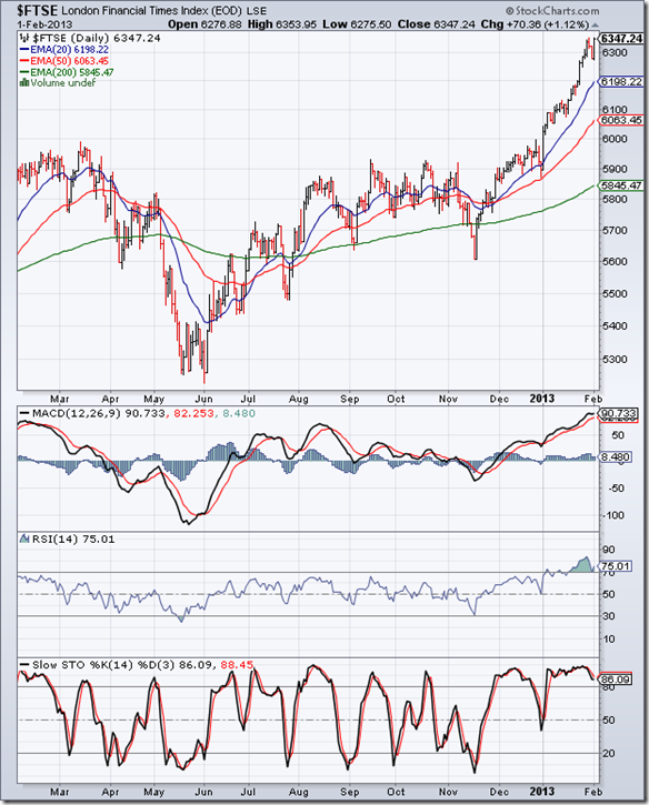
The 1 year daily bar chart pattern of FTSE 100 seems to be going from strength to strength – despite overbought conditions in the daily technical indicators. The 6300 level fell by the wayside as the index closed the week near 6350.
A brief 2 days correction last week didn’t change the overbought situation too much - all 3 technical indicators are still in their overbought zones. But this is a good time to remember phrases like ‘reversion to mean’ and ‘what goes up must come down’.
All three EMAs are moving up, but the index is trading 500 points above its 200 day EMA. That is a red flag. At the time of writing this post, FTSE was down more than 80 points. Worse may follow. No need to sell in a panic. It is a bull market correction, and the dip can be used as an adding opportunity.
Bottomline? Daily bar chart patterns of S&P 500 and FTSE 100 indices are correcting/consolidating after reaching 3 year highs. Dips can be used to add, but with tight stop-losses.


No comments:
Post a Comment