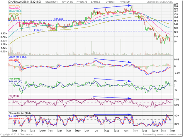
The stock chart pattern of Dhanalakshmi Bank had been consolidating sideways for 6 months within a rectangular band between 123 and 155 back in Apr ‘10, after making a bearish double-top at 178. The target of the double-top was met when the stock price fell to 130. By falling to 123, the stock retraced 39% of its spectacular rally from the low of 37 in Mar ‘09 to the high of 178.
The retracement was less than the Fibonacci level of 50%. The stock also found support from the rising 200 day EMA during the sideways consolidation. That led me to conclude that the bull market was intact, and the likely break out from the rectangular consolidation would be upwards. I had advised investors to buy only on a high-volume break out above 155.
Time to take another look at the bar chart pattern of Dhanalakshmi Bank. It is a text-book example of different technical chart patterns – consolidation, break out, divergence, support/resistance levels.
The sideways consolidation continued till early Jun ‘10 – the stock using support from the rising 50 day EMA, and testing the 155 level a few times. The inevitable happened on Jun 4 ‘10 – the stock broke above 155 on a volume spike, pulled back, consolidated sideways for a few days, and rose above its previous top of 178 on another volume spike on Jun 22 ‘10.
For the next 4 months, the stock made a series of higher tops and higher bottoms till it reached a new high of 212.50 on Oct 28 ‘10. Unfortunately for the bulls, it formed a bearish ‘reversal day’ pattern (higher top, lower close). Note that the MACD, ROC and RSI reached lower tops and the slow stochastic made a flat top while the stock touched a new high (marked by blue arrows).
The combined negative divergences hinted at a correction, which took the stock below its 200 day EMA to the 155 level in Nov ‘10. The pullback found resistance from the 200 day EMA, and the stock dropped like a stone to the 123 level in Dec ‘10. It is quite interesting how long-term support-resistance levels come into play in stock charts.
The ‘death cross’ (marked by blue oval) on Dec 16 ‘10 confirmed the bear market. On Jan 7 ‘11, the stock price broke below the support level of 123 and dropped to a low of 94 on Jan 31 ‘11. The correction from the peak of 212.50 was a huge 56% – and, in 3 months, retraced more than 67% of the entire bull rally of 20 months from 37 to 212.50. If the 94 level, which is another long-term support/resistance level, is broken the stock can drop to 74 or even lower.
The technical indicators have been making higher tops and bottoms of late. The MACD is above its signal line, but is still in negative territory. The ROC is below its 10 day MA and just inside the negative zone. The RSI touched its overbought zone, and dropped back but is above the 50% level. The slow stochastic briefly entered the overbought zone, but has dropped below the 50% level.
The bulls are attempting a revival. But things are not looking very bright. Even if resistance from the falling 50 day EMA can be overcome, the consolidation zone between 123 and 155 is likely to provide formidable resistance. The new management tried to expand too fast and finances and performance have been stretched.
The stock chart shows why investing in small-cap stocks is so risky, and why it is always a good idea to maintain a trailing stop-loss to protect profits. Ability to read technical signals provide adequate opportunities for entry and exit.
Bottomline? The stock chart pattern of Dhanalakshmi Bank is in the firm grip of bears. If you are still holding, sell on the next rise. This is not the time to be contrarian. Enter only after studying Q4 results. Yes Bank remains my preferred choice in the small-cap private bank space.

No comments:
Post a Comment