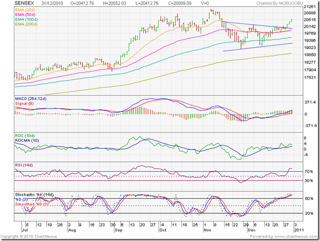
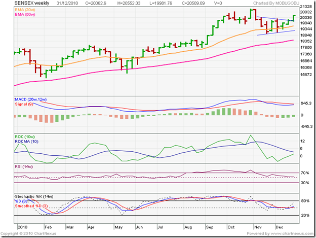
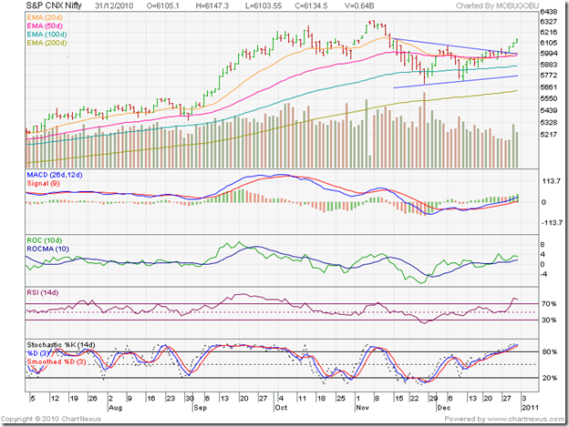
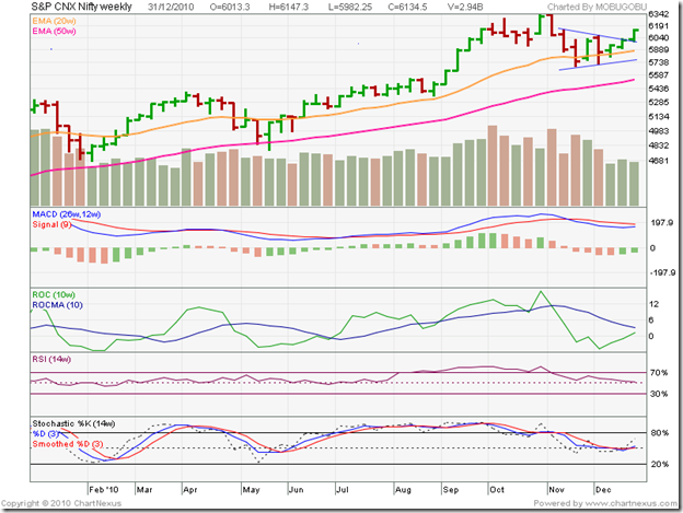
Before discussing the BSE Sensex and Nifty 50 index chart patterns, a quick aside. Dec 31 falling on a Friday means we have a weekly, monthly and yearly closing on the same day. For both the Sensex and the Nifty, we will take a look at the 6 months daily chart for the shorter-term outlook and the 1 year weekly chart for a longer term outlook.
BSE Sensex Index Chart
In last week’s analysis of the daily Sensex chart, I had drawn a symmetrical triangle from which a break out seemed imminent. I had also given a couple of possibilities each for bullish and bearish break outs. The bulls seem to have won this round, which is not too surprising since the Sensex is in a bull market.
The technical indicators are looking bullish. The MACD is above the signal line, and rising in positive territory. The ROC is positive and above its 10 day MA. The RSI and slow stochastic are well inside their overbought regions. The 20 day EMA remained entangled with the 50 day EMA for a month before both started moving up. All four EMAs are rising, and the Sensex is rising above them. The bulls are back in control.
Have the bears been routed? May be not – as per the 1 year weekly chart.
Note that the weekly Sensex chart also shows an upward break out from a symmetrical triangle. The Sensex is rising above its 20 week and 50 week EMAs (the latter is equivalent to the 200 day EMA). The bulls definitely have the upper hand.
The technical indicators paint a slightly different picture. The MACD is positive, but below the signal line. The ROC has just entered the positive zone but is below its 10 week MA. The RSI is barely above the 50% level. Note that it has been falling while the Sensex was rising. The slow stochastic was moving sideways while the Sensex was moving up.
NSE Nifty 50 Index Chart
The volume data on the Nifty 50 chart adds a different dimension. The rise from the previous bottom was on receding volumes. There was a volume spike on Thu. Dec 30 ‘10, but today’s rise was on reduced volumes. Bull markets need volume support to sustain.
The volume data on the weekly chart is more revealing. The break out from the triangle was on lower volumes. Break outs on low volumes may turn out to be ‘false’. Note that volumes have been receding since the Nov ‘10 top. Of greater concern is the higher volumes on ‘down weeks’ and lower volumes on subsequent ‘up weeks’.
What does the volume data indicate? I had warned of a bearish possibility that may be worth repeating:
‘If volumes remain thin due to lack of FII buying, then an upward break out from the triangle may be ‘false’ and the up move may get reversed by an ‘end run’ (a high volume drop).’
The possibility of an ‘end run’ remains open. Another interesting bit of statistics is that all 10 Decembers since 2001 were ‘up months’ but 7 out of the previous 10 Januarys were ‘down months’.
There is no reason to sell off expecting a high-volume drop, or that Jan 2011 will be a ‘down month’. The best way is to stay invested and preserve your profits by maintaining trailing stop-losses and/or booking partial profits.
Happy investing and have a great 2011!


No comments:
Post a Comment