Last week's analysis of the BSE Sensex index chart pattern included several concerns about the continuation of the bull rally - lower volumes on up days, negative divergences in the technical indicators, the widening distance between the 50 day and 200 day EMAs, and the possibility of an 'end run' after the upward breakout from the 'rising wedge' pattern.
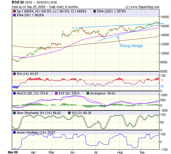
The cumulative effect of all the bearish signals led to a halt in the bull rally, but the bears could not wrest the initiative. The 6 months bar chart pattern of the BSE Sensex index shows that the truncated F&O settlement week passed off without any significant change:-
After Monday's holiday, the index made a new high of 16943 and a higher close of 16886 on Tue, Sep 22 '09 - once again on lower volume. The next day was a lower top and lower close day on much higher volume. Thu, Sep 24 '09 was a higher close day, but again on lower volume. The week ended with another down day as the index closed marginally lower for the week.
The positive signal is that the index managed to stay above the upper trend line of the 'rising wedge' pattern. But the negative signals from the previous week - mentioned in the opening paragraph - have not been overcome.
Next week will be another holiday-shortened one, and it is unlikely that there will be significant trading activity. That will tend to tip the scales towards the bears. Keep an eye on the 15600 level for support. That is where the 50 day EMA has reached. It is also the level of the top made in Aug '08.
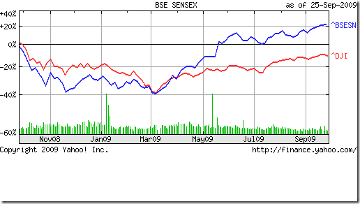
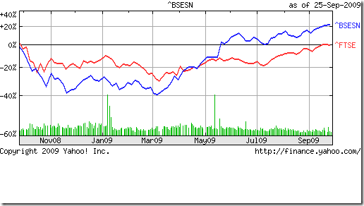
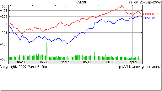
The business news in the western world have been dominated by the '1-year-since-the-Lehman-Brothers-collapse' stories. So I thought of including some charts, comparing how the BSE Sensex index has performed with respect to a few world indices. Here they are:-
The top two charts show that the Dow (USA) is down 10% and the FTSE (UK) is absolutely flat, while the Sensex is up 20% over the past 1 year. The bottom chart shows a marginal out-performance by the Shanghai (China) index. Note the 40% out-performance by the Shanghai Composite index through most of Jul '09 till a big ongoing correction started from Aug '09 - bringing the two indices closer in performance.
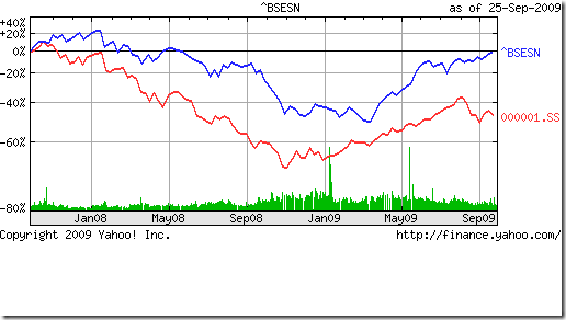
Now, a longer period chart throws up a tantalising possibility:-
The 2 years chart comparison shows the BSE Sensex completely flat, while the Shanghai Composite has dropped by 50% since Sep '07! What happened here? Well, the Shanghai Composite entered the bear market in Oct '07, when the Sensex was in the final stages of a bull market.
Fast forward to the current time. The Shanghai Composite completed its bear market rally and has been in a corrective mode since Aug '09. Will the pattern repeat? Will the Sensex follow behind and correct as much as the Shanghai Composite? The possibility does exist.
Bottomline? The BSE Sensex index chart pattern is technically in a new bull market, but the possibility of a big correction makes me circumspect. Avoid new investments and book some profits if you haven't done so already.
No comments:
Post a Comment