Last week's analysis of the Dow Jones (DJIA) index chart pattern led me to surmise that the index was slipping into a proper correction. The technical indicators had weakened and the volumes were uninspiring.
The index corrected barely 2%, lasted all of 3 days, made a quick turnaround and jumped above the resistance at 9450 on increasing volumes. So much for the efficacy of technical analysis!
An interesting question is: Why did the resistance at the 9450 level - a 38.2% Fibonacci retracement of the entire bear market fall - get broken? It had been tested three/four times in the previous two weeks. Every time a resistance (or support) level is tested in quick succession, it gets weakened. Three or four is usually the maximum number of tests that can be endured.
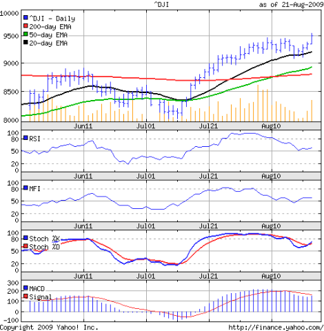
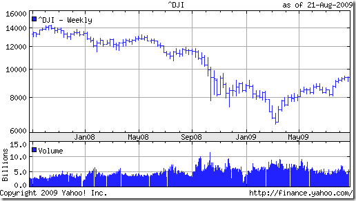
So, have the bulls finally trampled the bears into submission? That question can be answered best by looking at two different charts. The first is a 3 months daily bar chart pattern of the Dow Jones (DJIA) index. The second is a longer-term 2 years weekly chart of the Dow.
The index is above all the three moving averages. Both the 20 day and 50 day EMAs are above the 200 day EMA and all three averages are ascending, indicating a new bull market. Two hurdles remain - the 50% (10360) and 61.8% (11290) Fibonacci retracement levels of the bear market fall from Oct '07 to Mar '09.
The RSI is above the 50% level. So is the MFI. Both are showing negative divergences from the Dow. The MACD has fallen below the signal line. The slow stochastic dipped sharply from the overbought zone, but has moved up and the %K line is above the %D. The indicators seem to have weakened while the index reached a new high.
The longer term chart has a bigger concern. The rally from the Mar '09 bottom has happened between two converging lines, one connecting the two bottoms in Mar and Jul '09, and the other connecting several tops from May '09 onwards.
Such an index chart pattern formation is called a 'rising wedge' - which shows that buying demand is getting weaker as the index is rising higher. It is a bearish pattern and the DJIA can drop sharply if the trend line connecting the two bottoms (currently at 9000) gets broken.
Bottomline? The Dow Jones index chart pattern seems to be in a short-term bull run. Enjoy the ride, but keep strict stop losses. The longer term weakness and concerns remain.


No comments:
Post a Comment