Yes, you read it right. I'm going to discuss the chart pattern of the Hang Seng index today. In a globalised world, looking at the chart pattern of several stock indexes across the world may provide a better perspective of where the smart money is getting deployed.
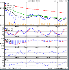
Let us look at the 6 months closing chart pattern of the Hang Seng. It does look quite similar to the Sensex chart.
(Please right-click on the image above and open it in a new tab or window for a better view.)
The Hang Seng's closing low made in end Oct '08 has not been penetrated yet. During the rectangular sideways chart pattern since the Oct '08 low, highs above the 15000 level were made in Dec '08 and Jan '09. This 'double top' formation has defined the upper level of the rectangular consolidation pattern.
The rally in Mar '09 has taken the Hang Seng to 'over bought' region as confirmed by the slow stochastics. The MACD is slightly in the positive zone. Both the ROC and RSI are supporting the bullish move, but showing signs of weakening. Volumes have increased the past couple of sessions.
An index (or a stock) can remain in the 'over bought' region for some time, so a reaction may not be imminent. But the weakness in the ROC and RSI may prove otherwise.
The index has penetrated both the 20 day EMA and the 50 day EMA from below, indicating bullishness. But it is still way below the 200 day EMA, which means it is still in a long term bear market. The double top above the 15000 level is likely to provide strong resistance.
Bottomline? The fundamentals of the global economy hasn't suddenly changed for the better. So this looks like a typical sharp bear market rally. But the increase in volumes and the 20 day EMA ready to cut across the 50 day EMA from below may be the first signs of a trend change.

No comments:
Post a Comment