Continuing my series of posts on global indices, today's discussion is about the Dow Jones chart pattern. It is interesting to compare the different global indices - while there are broad similarities, there are subtle differences. (Readers in the USA are requested to please give their inputs whether my analysis is on the right track or not.)
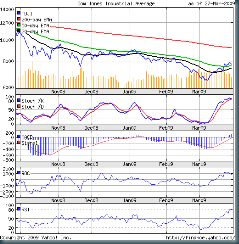
Let us have a look at the 6 months closing chart pattern of the Dow Jones Industrial Averages:-
(Please right-click on the image above and open it in a new tab or window for a better view.)
The Dow made a 52 weeks low in Nov '08 (rather than in Oct '08 for the Sensex and Hang Seng) and then entered the sideways consolidation chart pattern, much like the other indices.
It pierced the Nov '08 low and made a new 52 weeks low in Mar '09. Then followed a sharp upward rally that took it beyond the resistance of the 50 day EMA (unlike the FTSE).
Some analysts in the USA termed the Mar '09 rally as the beginning of a new bull market, based on the fact that the Dow rallied more than 20% from its Mar '09 bottom. Apparently, a 20% rise from a bottom is considered a 'definition' of a bull market.
I'm not particularly convinced by such a definition. The 200 day EMA is generally accepted as the long term trend decider of the market. When an index is below it, it is a bear market. Only when the index moves above the 200 day EMA from below, and the 200 day EMA stops moving down and begins to flatten out will the trend change to a bull market be confirmed.
The Dow is presently almost 1700 points below the 200 day EMA level of about 9500. That indicates that the long term bear market is nowhere close to an end.
Mind you, waiting for the index to crossover the 200 day EMA may prevent an investor from catching the next bull ride at the lowest point. But trying to catch the exact bottom is a near impossible task. Better to be safe than sorry.
The technical indicators are showing weakness, and the Dow is reflecting that. The ROC and RSI are turning down from overbought regions. The slow stochastics is in the overbought zone but the %K line is about to go below the %D line. The MACD is still positive.
The volumes (overlaid on the index chart) had been lower during the last couple of days of the rally. Sure enough, the Dow started to move down, though it closed at a higher level than that of the previous week.
Bottomline? The sharp rally seems to be over. The Dow is back in the sideways consolidation pattern, where it is likely to remain for a while longer. The Q1 and Q2 results will indicate which way Mr Market will move next.

2 comments:
I would be interested to read your similar views for BSE and NIFTY.
Best Regards,
TIP Guy
Hi TIP Guy
The Sensex Chart Pattern was discussed on Saturday, Mar 28,'09. I don't track the Nifty because Nifty authorities do not show opening gaps.
Post a Comment